Image #1
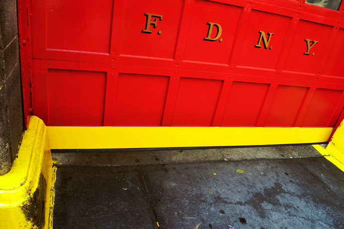
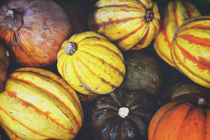
What makes this shot so interesting to me is the vibrancy of the color. The red and yellow, so striking against the bluish tint of the sidewalk, appears almost cartoonish. There's no action taking place, but the image still exudes a fire-ish energy (appropriate, considering the subject matter). Contrasts exist here in the ways the colors relate to each other, and the pencil-like shadows in between.
Image #2
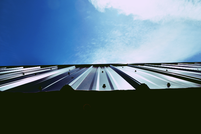
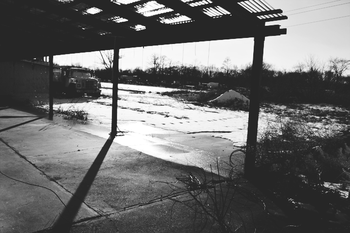
This shot represents horizontally the rule of thirds. What could be considered flat given the first and third sections, is made dimensional by the second section. The lines moving towards the horizon line make the viewer feel as if they're reaching towards something far away, and provides a considerable depth of space. This picture is particularly interesting in the way it incorporates both rigidity of line and softness. The boldness of the shadows juxtaposes the lightness of the clouds in the sky.
Image #3
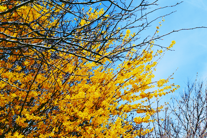
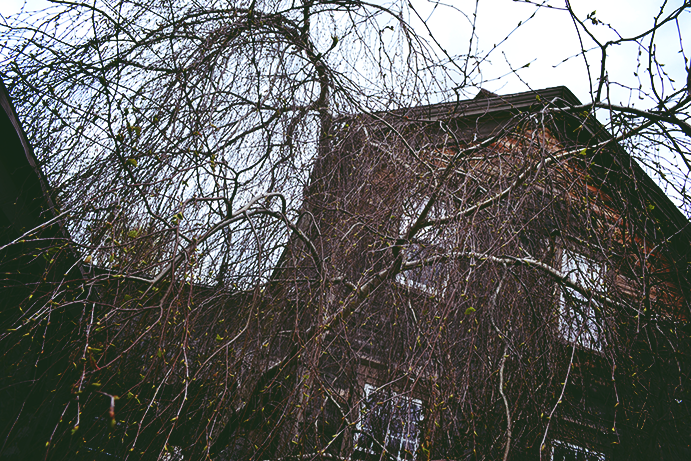
This image has a two dimensional feel, almost as if the tree branches were pasted onto the sky. The straightforwardness of the camera's perspective contributes to this lack of depth, as well. Even still, the shot is interesting, leading the eye geometrically across the frame (bottom-left, top-left, bottom-right, top-left again). The vivid detail comes from the shadow of the buds, and the vibrancy of the colors distinguishing themselves from the black contrast of the tree branch. The black is concentrated so heavily on the left, dispersing as it approaches the sky to the right, removing weight from the image and providing a lightness.
Image #4
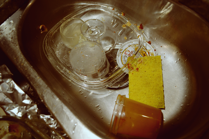
The subject of this picture is different from most of my other shots. Even though the subject matter is right in the middle of the frame, it doesn't feel stuck or pasted--it manages a precariousness. The monochromatic color scheme isn't black and white, rather brownish in hue. Because of this, the yellow sponge becomes more eye-catching (even though it's kind of ugly). The angle and tight frame emphasizes the clutter in the sink, making the viewer feel a little claustrophobic. In contrast to the texture of the sponge and crumbs is the smooth and clean highlights of the metal sink and glass wear.
Image #5
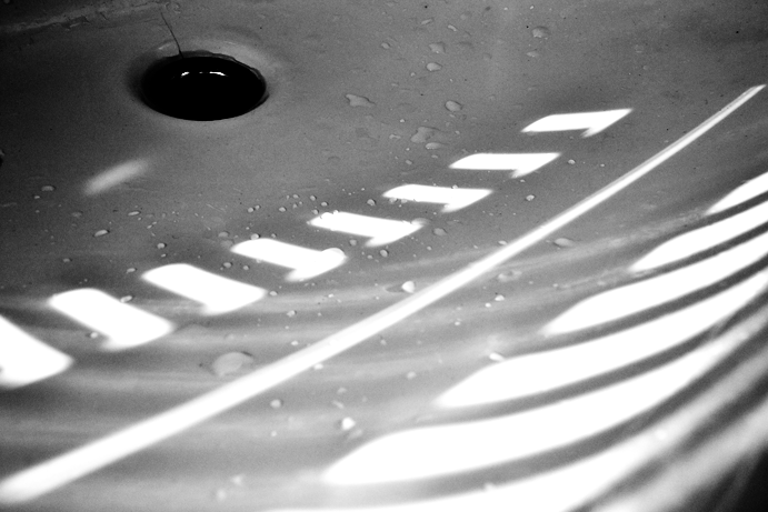
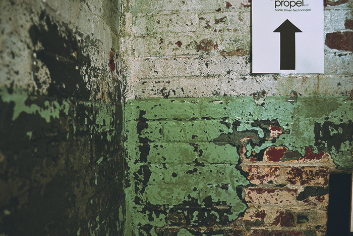
This picture has a real graphic quality, with the rich shadows and the distortion of what could be completely linear highlights. Framing the picture in this way, so close and personal, leaves room for interpretation as to the subject matter. And, though there isn't much subject beyond what contrasts white from black, the picture has a real sense of depth, moving the eye in a circular direction around the image.
Image #6
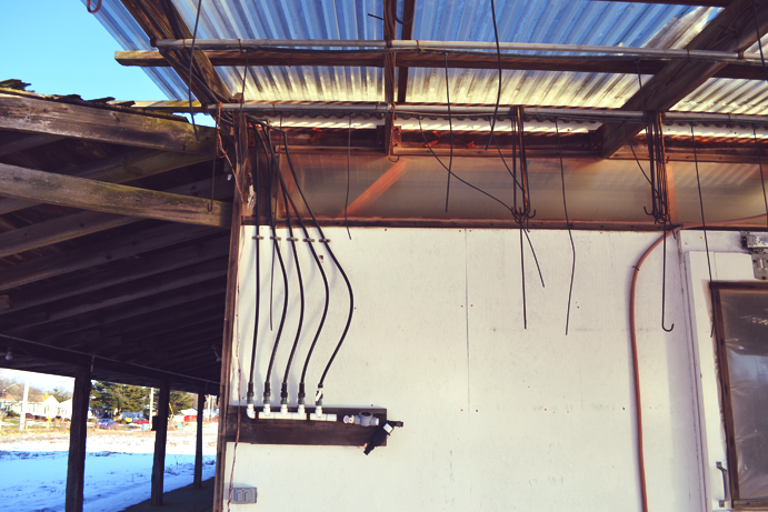
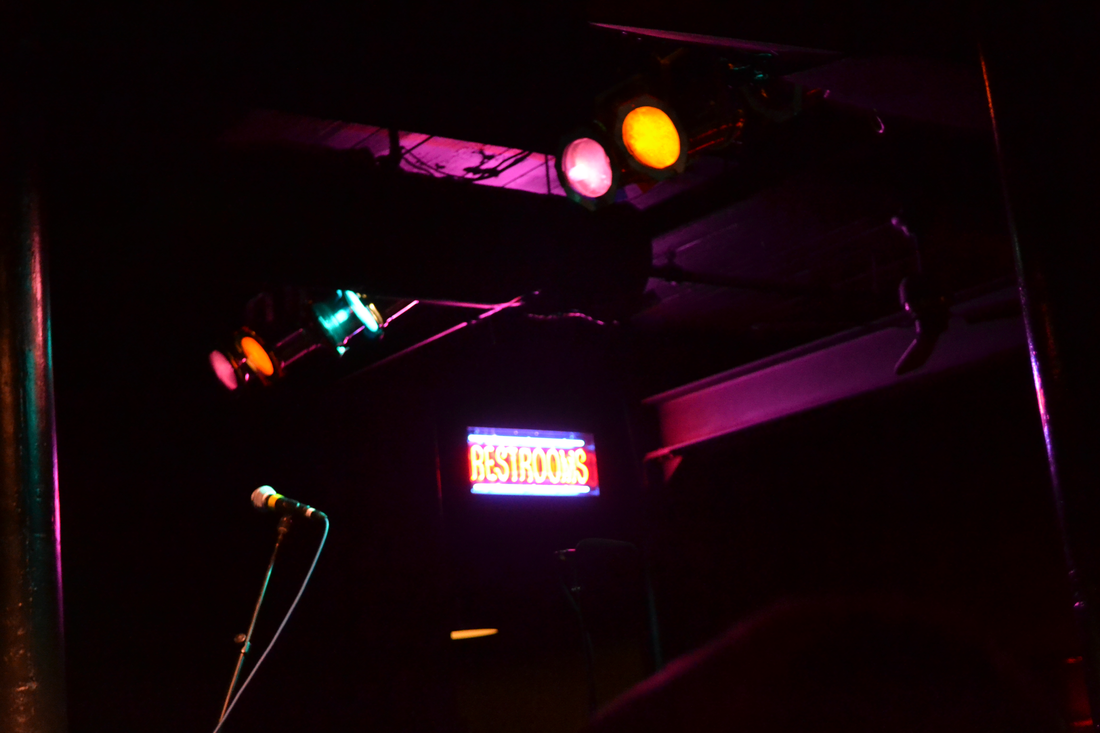
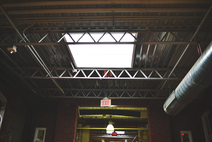
What makes this image conceptually interesting is the placement of the hard shadows and the white highlights. It appears in a pattern, from top to bottom: black, white, black, white, black. Instead of maintaining the color of the image, I wanted to change it to grayscale and really emphasize through contrast of shadow the basic geometry of the architecture. The main parts of the photograph are dark and heavy, silhouetted against the light source behind it. But then, when looked at carefully, the eye picks up the delicate black lines, falling like strings from the building and suspended in the sky. These compliment both the strength of the architecture and the fine lines of the surrounding nature.
What makes this shot so interesting to me is the vibrancy of the color. The red and yellow, so striking against the bluish tint of the sidewalk, appears almost cartoonish. There's no action taking place, but the image still exudes a fire-ish energy (appropriate, considering the subject matter). Contrasts exist here in the ways the colors relate to each other, and the pencil-like shadows in between.
Image #2
This shot represents horizontally the rule of thirds. What could be considered flat given the first and third sections, is made dimensional by the second section. The lines moving towards the horizon line make the viewer feel as if they're reaching towards something far away, and provides a considerable depth of space. This picture is particularly interesting in the way it incorporates both rigidity of line and softness. The boldness of the shadows juxtaposes the lightness of the clouds in the sky.
Image #3
This image has a two dimensional feel, almost as if the tree branches were pasted onto the sky. The straightforwardness of the camera's perspective contributes to this lack of depth, as well. Even still, the shot is interesting, leading the eye geometrically across the frame (bottom-left, top-left, bottom-right, top-left again). The vivid detail comes from the shadow of the buds, and the vibrancy of the colors distinguishing themselves from the black contrast of the tree branch. The black is concentrated so heavily on the left, dispersing as it approaches the sky to the right, removing weight from the image and providing a lightness.
Image #4
The subject of this picture is different from most of my other shots. Even though the subject matter is right in the middle of the frame, it doesn't feel stuck or pasted--it manages a precariousness. The monochromatic color scheme isn't black and white, rather brownish in hue. Because of this, the yellow sponge becomes more eye-catching (even though it's kind of ugly). The angle and tight frame emphasizes the clutter in the sink, making the viewer feel a little claustrophobic. In contrast to the texture of the sponge and crumbs is the smooth and clean highlights of the metal sink and glass wear.
Image #5
This picture has a real graphic quality, with the rich shadows and the distortion of what could be completely linear highlights. Framing the picture in this way, so close and personal, leaves room for interpretation as to the subject matter. And, though there isn't much subject beyond what contrasts white from black, the picture has a real sense of depth, moving the eye in a circular direction around the image.
Image #6
What makes this image conceptually interesting is the placement of the hard shadows and the white highlights. It appears in a pattern, from top to bottom: black, white, black, white, black. Instead of maintaining the color of the image, I wanted to change it to grayscale and really emphasize through contrast of shadow the basic geometry of the architecture. The main parts of the photograph are dark and heavy, silhouetted against the light source behind it. But then, when looked at carefully, the eye picks up the delicate black lines, falling like strings from the building and suspended in the sky. These compliment both the strength of the architecture and the fine lines of the surrounding nature.
